Explain services and your service area, show genuine work with permission, and keep enquiries simple. Request only information needed for an initial assessment. A form does not replace professional evaluation or a binding quote.
Organise services around the customer’s need
Internal technical terms are not always clear to visitors. Begin with the need: what needs repairing, building, maintaining or changing? Group relevant services underneath. If some jobs are not offered, a factual boundary can help. Avoid an excessively long homepage that makes every detail look equally important. Dedicated pages often suit distinct service areas. They can explain requirements, the process and common questions. Prospects can then more easily decide whether their job fits the business.
Describe the service area honestly
Explain which towns or regions you actually serve and whether particular services have a different range. Serving a place does not mean you have an office there. Do not invent addresses or local references. If travel or a minimum job size matters, clarify that before a specific commission. Useful regional information helps visitors assess their situation. A large number of nearly identical town pages is usually less helpful than a clear explanation of where and how you really work.
Show genuine projects with context
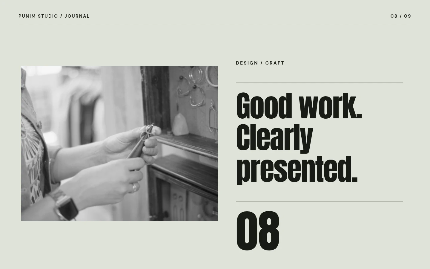
Photographs can make quality visible when they accurately represent real work. Briefly explain the task and what your business contributed. Obtain client approval and consider personal information in the image. Addresses, number plates and confidential details should not be published accidentally. A carefully documented selection is more valuable than a large gallery without context. If approved project photos are unavailable, show the actual workspace or explain your approach. Do not present another company’s construction photographs as your own references.
An enquiry need not be a questionnaire marathon
Name, contact route, location and a short description are often enough for an initial assessment. Ask for additional details only when genuinely necessary. Explain that an enquiry is not yet a binding quote. If photographs may help, plan transmission, retention and safeguards deliberately; an upload is not automatically required. Fields and errors must remain usable on phones. Provide clear feedback after submission and an alternative contact route for technical problems. Do not promise an immediate reply while the team is working on site.
Trust requires verifiable information
Qualifications, memberships and certificates should be accurate and current. Use logos only with appropriate rights. Do not invent figures about experience, projects or satisfaction. Terms such as emergency service or around-the-clock availability must match actual provision. A website should not imply such a service when it does not exist. A clear process can build confidence: initial contact, professional assessment, quote and implementation. Appropriate legal review is advisable for warranties, terms and specific industry duties instead of copying statements from other websites.
Design can be robust and calm
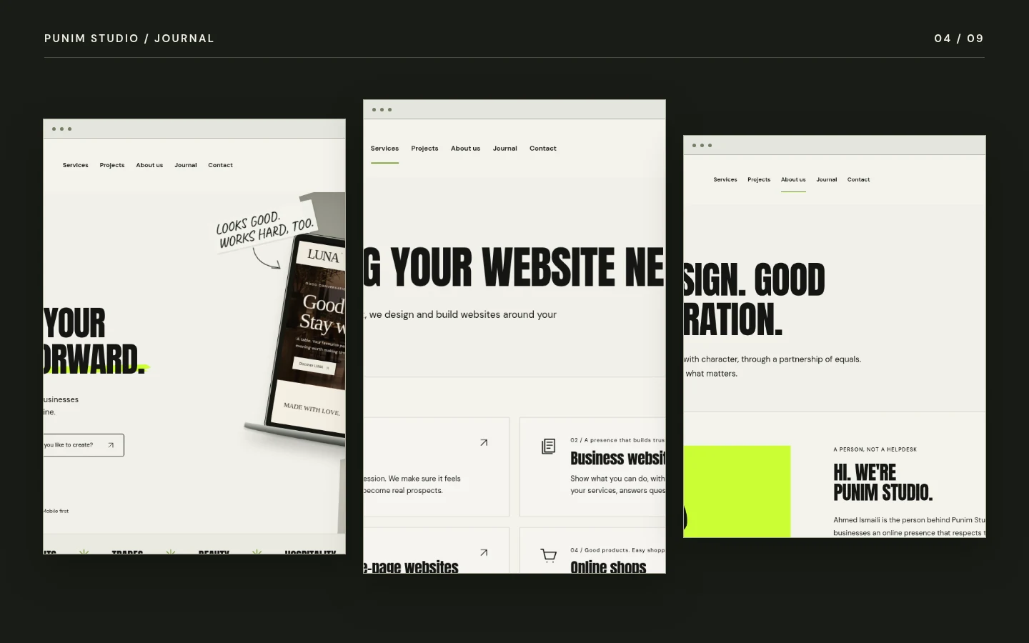
A strong presence does not require flashing elements. Clear typography, good contrast and real materials can create a dependable impression. Use images deliberately and keep text readable. Contact options should be visible without filling every section with competing buttons. A good website also works on older phones and weaker connections. Check image sizes and avoid unnecessary external services. Design should support your work and guide people to the appropriate next step rather than create another task for them.
Prepare the next step
List main services, the real service area and common questions from the office or phone. Select approved images and check current business details. Decide who handles incoming enquiries and how they reach technical planning. If a website already exists, record relevant URLs and content. A new design should not remove that history carelessly. A clear brief supports a website that fits the business and makes first contact easier without creating false expectations about price or outcome.
Check enquiries in daily operations
Test the complete journey with a realistic request clearly labelled as a test. Does it reach the right person? Are location and description understandable? Can the team identify a sensible next step? Check incomplete input and a technical failure too. Visitors need understandable guidance rather than a blank page. Document the process and retain an alternative contact. Digital first contact can then help the business rather than become another unmanaged inbox. Retest after hosting changes because a form that looks correct can still fail to deliver on a different server.